Capturing Design Rationale with QOC
One technique I keep coming back to time and time again is that of capturing design rationale in QOC (Questions, Options and Criteria) diagrams.
Questions, Options and Criteria
Over two decades ago, a classic text on design rationale was published: 
The book was fascinating for me as it focused on understanding the design process and the way that design questions are resolved by designers. I loved the focus on the design process, especially since I was a student when the book was published and hadn’t yet gained any real practical experience outside of academia. I felt that this book gave me a great insight into how design actually happens.
One chapter in particular that stood out was the second chapter in the first part of the book, “Questions, Options, and Criteria: Elements of Design Space Analysis”. This chapter describes a notation for capturing the results of design discussions such that these results can be used to document the design and to ensure that a range of alternative design options are carefully considered and weighed up against each other.
During any design process, designers ask and answer many questions about the design. At the end of the design process, an artifact is designed or created but the story of how that artifact came into being is often lost. That means any opportunity for learning why the artifact was designed that particular way depends on the availability and the memory of any of the designers involved.
The notation is very simple (it’s really just a set of boxes and lines, with lines connecting boxes that contain text descriptions of question, options and criteria). The simplicity of the notation though doesn’t really hint at how powerful it can be to use the notation during the design process.
Simple power
In any design discussion, designers discuss how to resolve some design question. For example, imagine we are designing a new install experience for Visual Studio and are discussing how the user selects the individual components and tools that they want to install. We could simply provide them with a list of all of the components that they can install and allow them to check off each one that they want. That would give them fine grained control over what they want to install but it would make the process of choosing all the components they want considerably time consuming, given that the list of components is large. It could also lead to users making neglecting to choose some particular component which is essential for the type of development that they do (desktop, web, mobile etc)
Alternatively, we could offer a list of workloads or groups of components. These workloads would group together a set of individual components that are relevant to a specific workload or type of development. That way the user focuses on what they want to do (e.g., build a cross platform mobile app) and then selects the workload that is relevant for that task. This selects a set of individual components for them instead of them having to determine which of these components they would need in order to build a cross platform mobile app.
In this design discussion we have one question (“How should developers select the components they want to install?”) and two options (“From a list of individual components” and “From a list of workloads”). We have three criteria to evaluate each option with (“Offer fine grained control”, “Make users confident they have everything they need”, “Decrease amount of time spent in install”). Given this, we can graph this design discussion like so:
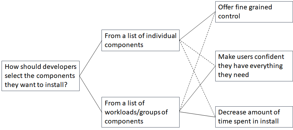
The diagram above captures the questions, options and criteria and then visualises the evaluation of each option against each criteria by the use of a solid line to indicate a positive evaluation and a dashed line to indicate a negative evaluation.
You can see that during the design discussiuon, the designers considered the option of showing a list of workloads as positive for making users feel confident that they have all the components that they need (since they select a workload and the group of components required for that workload are selected) and for decreasing the amount of time spent in install (since they don’t have to check every component in a workload individually). It’s considered negative though for providing fine grained control since users can’t easily select individual components.
The diagram captures the discussions that happened during the design discussion. By reviewing it after the discussion, the rationale for the final decision that was made can be determined.
Using QOC during a design discussion
Capturing the design rationale for a design is very helpful when that design evolves. New designers who need to adapt or extend the design can learn from the design rationale for the original design and can use that to evolve the design appropriately.
But QOC isn’t just about capturing documentation. The real power of the QOC notation becomes apparent when using it during a design discussion, as opposed to once a discussion has happened.
Premature convergence
It’s quite common during a design discussion to converge too quickly on a solution to a problem. As soon as somebody comes up with an idea, it is very tempting to run with that idea and try to make it work. The longer you run with that idea, the more attached you become to it and the harder it becomes to let go of the idea in the face of evidence indicating that the idea might not be as good as you originally thought.
To avoid prematurely committing to an idea, it’s always good practice to consider multiple alternatives early on in the design process, to diverge and look at other options before deciding to converge on one design idea or solution.
This is difficult though. Coming up with one idea or solution to a problem is challenging; coming up with more than one solution just increases the challenge.
QOC helps with this diverge phase of design by making the design space (the area in which alternative designs can be discovered) more explicit. It does this by forcing you to describe the criteria you are using to evaluate your designs. When you evaluate a design idea against some set of criteria and judge the idea positively against some criteria and negatively against some other criteria, the next question to ask is “Is there another idea or design that we can come up with that would be judged positively against these criteria?”. Effectively you are reflecting on your first idea, thinking about what the pros and cons of that idea are, and then using the cons of your first idea to help identify an alternative solution.
For me, this is the greatest strength of the QOC notation. My making the design criteria, and the evaluations of each design against those criteria explicit, you make the design space explicit and can more easily identify alternative solutions to a design idea.
Cascading design questions
One challenge I’ve seen teams grapple with when using QOC is clearly demarcating questions from options and criteria.
Quite often a design idea or option that is proposed to answer a design question will itself lead to a host of additional design questions. Especially when you are starting out on a high level design question, the options that you consider won’t all be fully fleshed out. Each option itself could be broken down into a set of additional design questions that need to be answered as you refine the overall design idea.
I’ve seen some teams try to capture all of these additional questions as variations on the same option, with the result that one QOC diagram has one design question with a huge number of design options (often more than ten). At this point it becomes unwieldy and difficult to navigate.
The solution is to keep questions, options and criteria in one diagram at the same level of abstraction and when further refinement of a design option is required, do that in another QOC diagram. Effectively the question being answered in the new diagram is related to one of the options in the original diagram. In this way the QOC diagrams cascade from one another, with an option in one diagram leading to one or more design questions that are answered in subsequent diagrams.
Summary
QOC is a straightforward notation that provides two main benefits:
- It captures the design rationale as an output of a design discussion. This helps to document the decision making process for a design and can be very useful when maintaining and evolving the design.
- It helps make the design space more explicit, encouraging teams to consider multiple alternative design solutions and avoid converging on a solution prematurely.
It’s a straightforward, simple notation that is well worth learning about and adding to your set of design tools.